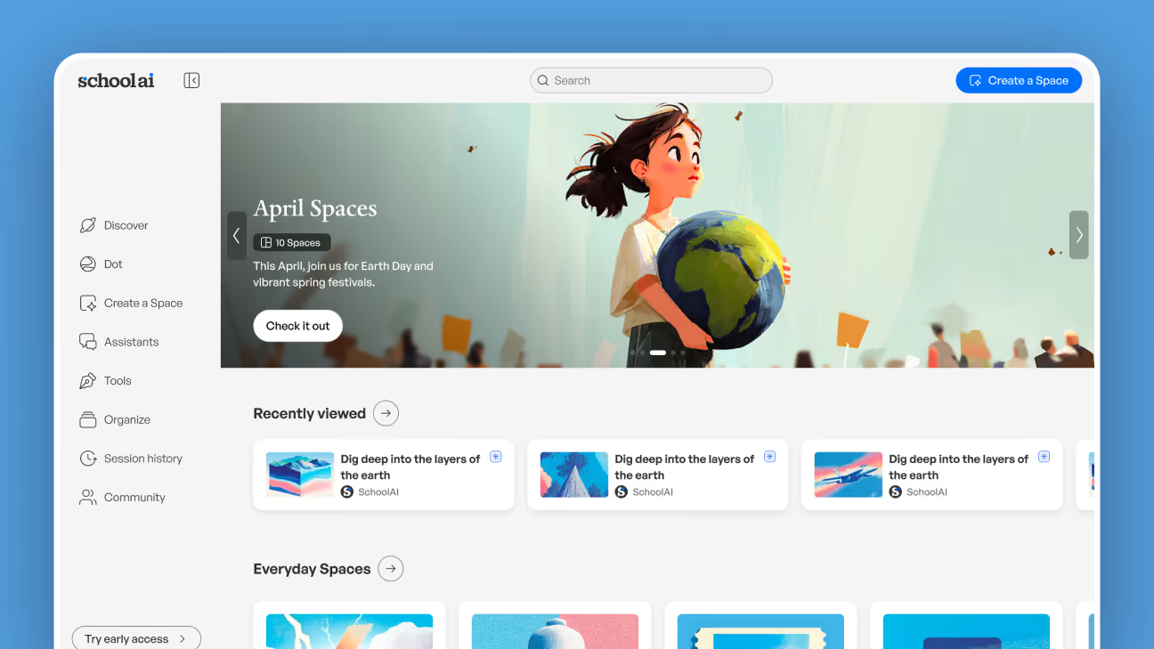
SchoolAI—Stipple Design System
Engineers don’t need more rules. They need to fall into success.
SchoolAI had grown fast, and it showed: screens were built bespoke, so layout, type, color and components drifted apart page by page. I led Stipple, the design system that brought the app back together and cleared most of our accessibility debt along the way. Paired with AI prototyping, it changed handoff too: engineers got real components instead of pictures of them.
- WCAG 2.1 AA
- Compliance target
- 0
- Critical and serious issues left on our surfaces
- Near zero
- QA on design-to-code handoffs
- 239 → 1
- Places the same form was hand-built
The Problem—Every screen was built from scratch
You can’t out-triage a product that keeps producing new bespoke screens.
Nobody set out to build an inconsistent product. Bespoke screens were the fastest way to ship. The app stopped agreeing with itself: spacing, type, color, the same component rebuilt five slightly different ways.
The accessibility audit was where that bill came due: thousands of flagged issues. Our users are teachers and students, so this was never a compliance checkbox. It was whether a kid using a screen reader could do the assignment.
Research—The same few mistakes, made over and over
These were not screen bugs. They were the predictable cost of building every screen from scratch.
Carson Fairbourn’s Sentinel analysis clustered the issues by root cause instead of listing them. The backlog was a few patterns, repeated.
- 239 form and ARIA labeling issues weren’t 239 problems. They were one pattern, hand-rolled 239 times.
- 128 contrast issues came from a handful of color pairings nobody had tested, reused on screen after screen.
- Reflow and zoom failures traced to hand-built layouts, because there were no layout primitives to reach for.
- Text resizing broke wherever type was set in fixed sizes rather than a shared scale.
We could not fix them faster than new screens were being built.
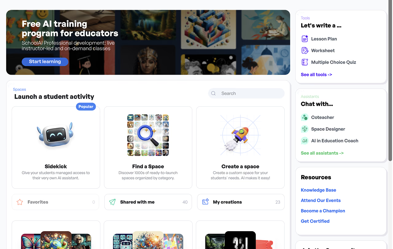
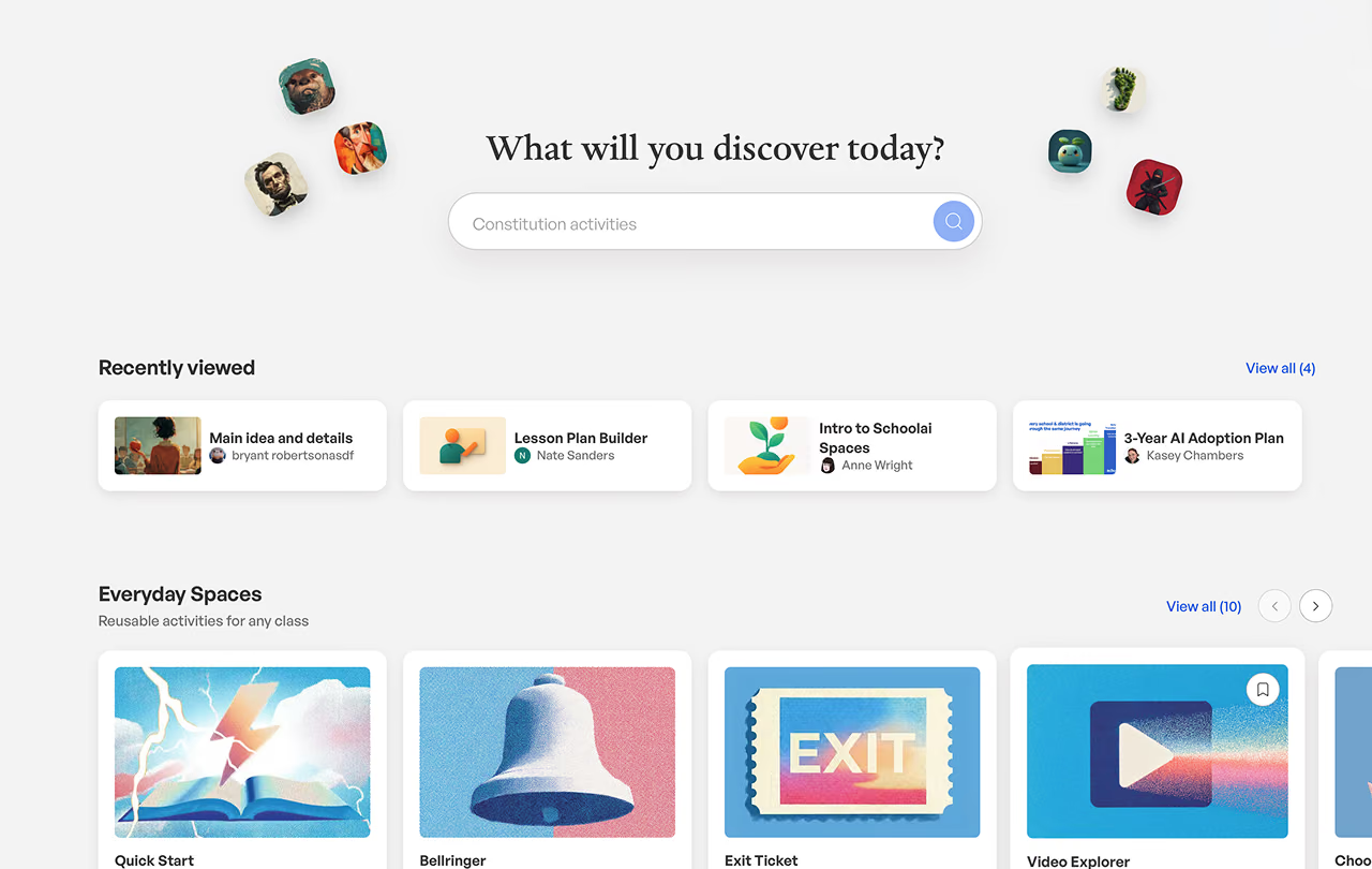
Before
The Solution—Make the correct thing the easiest thing
A design system that relies on people remembering it decays.
Stipple was made the fastest way to build a screen, with the right behavior already inside. Agents and checkpoints catch drift before it ships.
01—Replace bespoke with components that are correct by construction
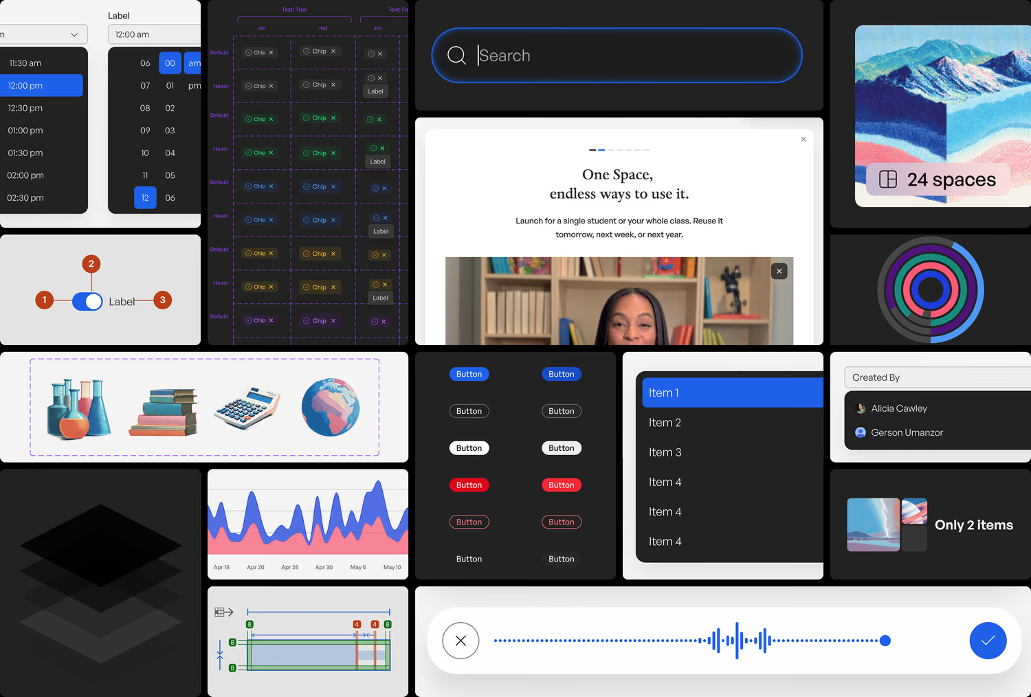
Dozens of components were rebuilt to be correct by default, plenty more were designed from scratch, and five overlapping ones collapsed into a single combobox. Parker Holladay drove the architecture. Form and FormField are the clearest case: labels, descriptions, error states and ARIA relationships come free, closing the audit’s largest cluster.
02—Tokenize color and type so pairings can’t be improvised
I tested every primary color against the backgrounds it actually appears on, not the pairings in the docs, then locked the results into tokens. A responsive Heading component and tokenized type utilities replaced fixed sizes.
03—Build contrast from opacity so the palette stays small
Contrast levels are expressed as opacity rather than hardcoded values, which is what lets a small set carry real depth: five surface levels, and text down to primary, secondary and error.
04—Ship layout primitives so nobody has to improvise
Carson built layout components that handle reflow and zoom correctly by default. The failures were never carelessness. The system had never given anyone a correct option to reach for.
05—Put agents on drift
Claude runs inside Figma via Code Connect, checking whether what Figma calls the source of truth matches what ships. That gap is how design systems fail: slowly, invisibly, too tediously to catch by hand.
06—Add checkpoints so the system defends itself
Every pull request runs accessibility checks, plus one that flags anything drifting off the system. Once Figma and the code agreed on tokens in March 2026, those tests got reliable enough to tell a real failure from a false alarm.
The Brand—Where the name came from
With one prompt, anyone on the team can make on-brand illustrations.
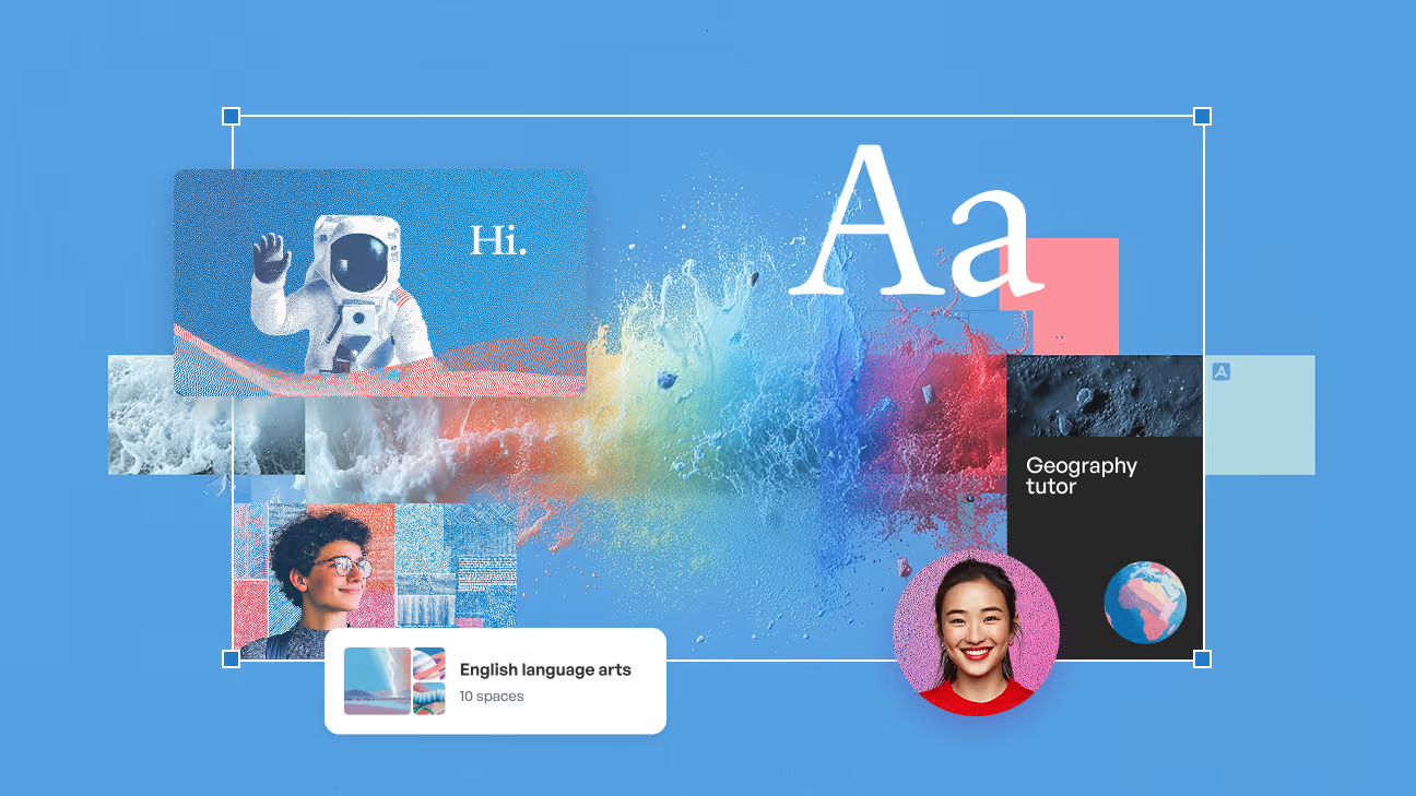
The system carried the brand too: typography, color, and how illustration should look. Illustration was the hard part, so I wrote a Midjourney prompt the whole team could reuse. It defines style, color palette, and texture, achieving reliable results that are on-brand every time.
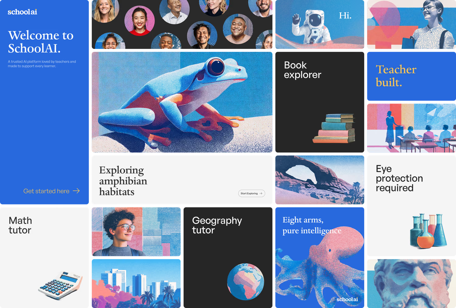
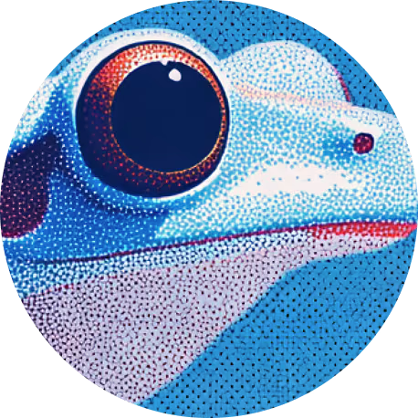
The dotted texture is where Stipple got its name. It helps lend a human touch to generated images, and harkens back to old textbook illustrations.
The System—What Stipple actually contains
- 479 variables in two layers. A Tailwind primitive collection feeds a semantic SchoolAI one, so a color decision happens once and lands everywhere.
- Light and dark as modes, not themes. 84 of the 200 semantic tokens resolve differently per mode. The rest hold still, which keeps dark mode from becoming a second design.
- Six responsive breakpoint modes. Type scale, page width, margins and columns are tokens. So is layout state: whether the side nav shows, which table columns survive.
- 86 text styles, including a serif ramp alongside the sans one, so brand typography lives inside the system instead of beside it.
- Seven chart families: area, line, bar, pie, radial, radar and their tooltips, each with their own color tokens.
- AI-native components: chat, composer, artifact messages, suggestions, powerups. The parts most design systems don’t have, because most products aren’t a model.
How I Work—Prototyping in the production repo
A high-fidelity prototype is a convincing lie.
Stipple is shadcn/ui and Tailwind, documented in Storybook and held one-to-one with Figma. That parity is what makes prototyping in Claude Code against a branch of the production repo work: the component I pull is the one in the Figma library, and the one that ships. Engineering gets a working JSX file instead of a spec, and QA on those handoffs is near zero.
A high-fidelity prototype looks like the product but shares no code with it, so every element gets re-invented during build. Prototyping in the repo flips that. If a component doesn’t exist, I find out now instead of in QA. If it isn’t accessible, I inherit that at design time, when it’s cheap to fix.
It’s the same argument as the system itself, applied to my own work: make the correct path the convenient one, and adherence stops being a discipline problem.
Outcome—Where it landed
The accessibility numbers get quoted. The system is what moved them.
- Layout, type, color and components brought into line across the app.
- All critical and serious accessibility issues resolved on the team’s surfaces in Q1 2026.
- Form and labeling patterns fixed in the library rather than at 239 call sites.
- Layout components shipped, resolving the WCAG reflow failures.
- Token parity confirmed between Figma and shipped code.
The audit found the work; the system made it fixable in one place instead of hundreds. The agents and checkpoints stayed after I left, which was the point of encoding the rules rather than documenting them.
Learnings—Key takeaways
Design for how people actually work
Bespoke was simply the fastest route. Change which route is fastest and the behavior changes on its own.
Cluster before you triage
Grouping issues by root cause before fixing any looked like not shipping. It set the strategy.
Run the audit alongside the system
The audit ran in tandem with the design system work. Not the same project, but most of what it found traced back to the same root causes, so bringing the app onto components cleared a large share of it.
Automate the rule, not just the fix
Fixing the components solved today. Agents watching for drift and checkpoints in CI stop the backlog regrowing after the person who cared about it leaves.
Next