Soldier Mountain
Giving a classic ski resort a new look.
Soldier Mountain is a ski resort in southern Idaho that has been running since 1947. New owners bought it with plans to grow it, and needed a brand that could grow with it.
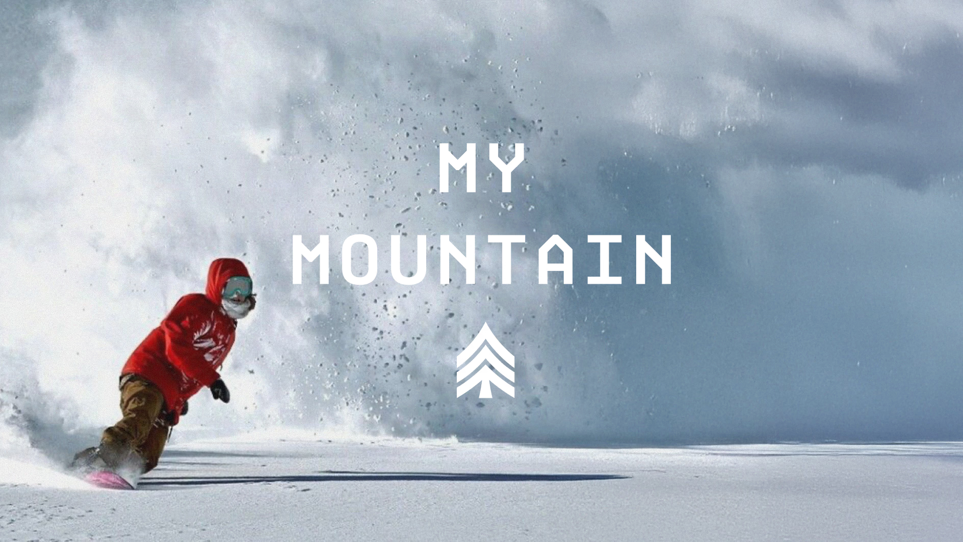
The Problem—The mountain had aged well. The mark had not.
Two friends started Soldier in 1947 after watching the Olympic tryouts at Sun Valley. They cut the timber, built the lodge and ran two rope tows. Today it boasts fourteen hundred feet of lift-served vertical and guided cat skiing on the peaks above the lifts.
The new owners had plans, including a lot of new mountain biking trails, and wanted a brand that could carry them. Something modern. Something a teenager would be proud to wear. What they had was a cartoon fox on skis.
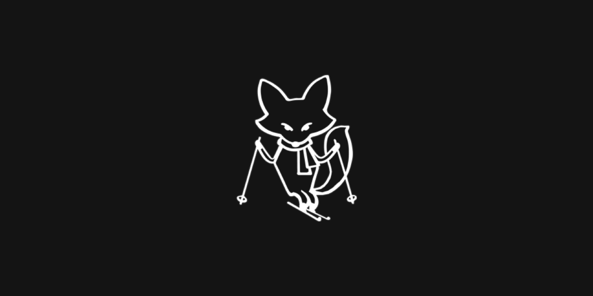

Before
The Work
Dan Larkin, one of the new owners, brought me in, and the work was mine start to finish. I grew up around ski resorts, so getting to brand one was a dream come true. I got to work.
I explored dozens of concepts. Some carried the old fox forward, combining it with a snowflake, and some went somewhere else entirely. These are a few that did not make the cut.




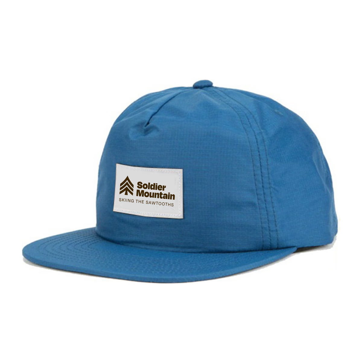
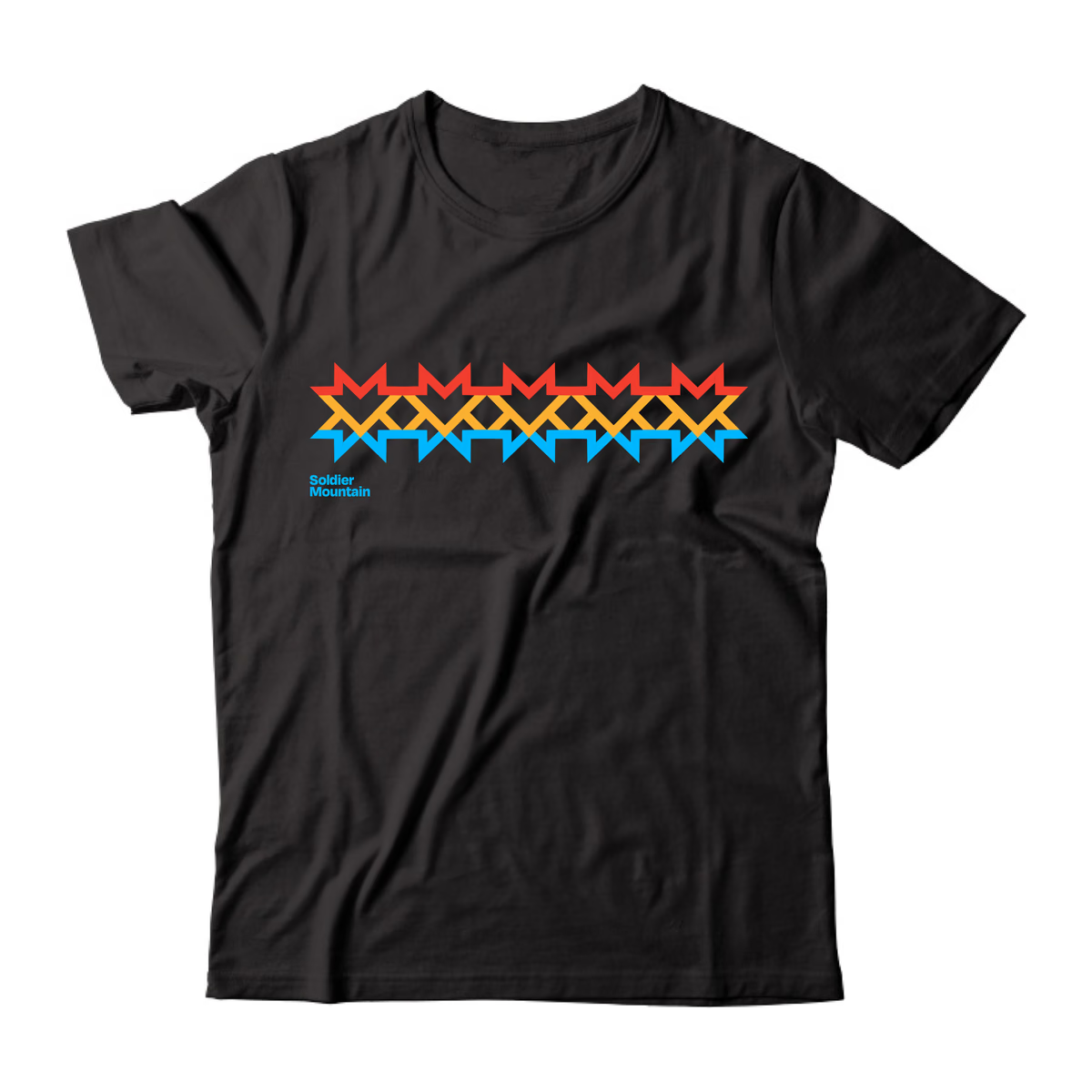
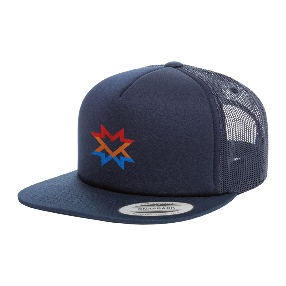
Every one had to be mocked up across several surfaces, soft goods included, to be sure it was versatile enough for a resort.
The Mark
This ain’t Deer Valley, kids.
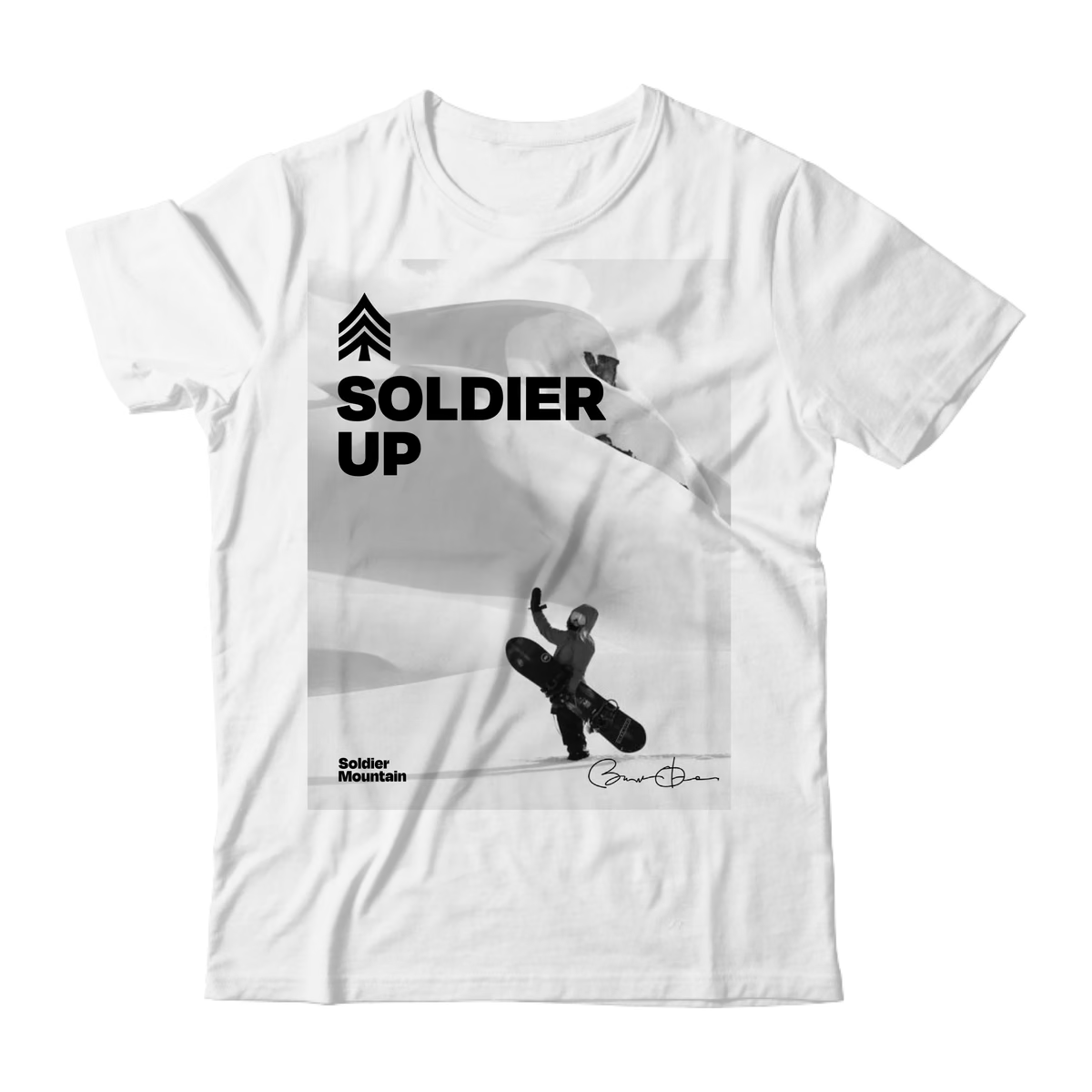
The mark is rank insignia. Three chevrons and a trunk, simple enough shapes to survive an embroidered hat at one end and a trail sign at the other.
The lettering is drawn off military stencil. Squared, corners clipped, and stopped well short of costume.
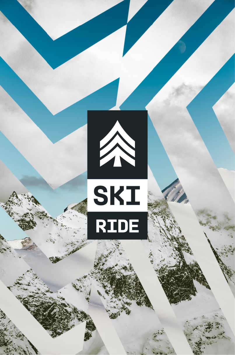
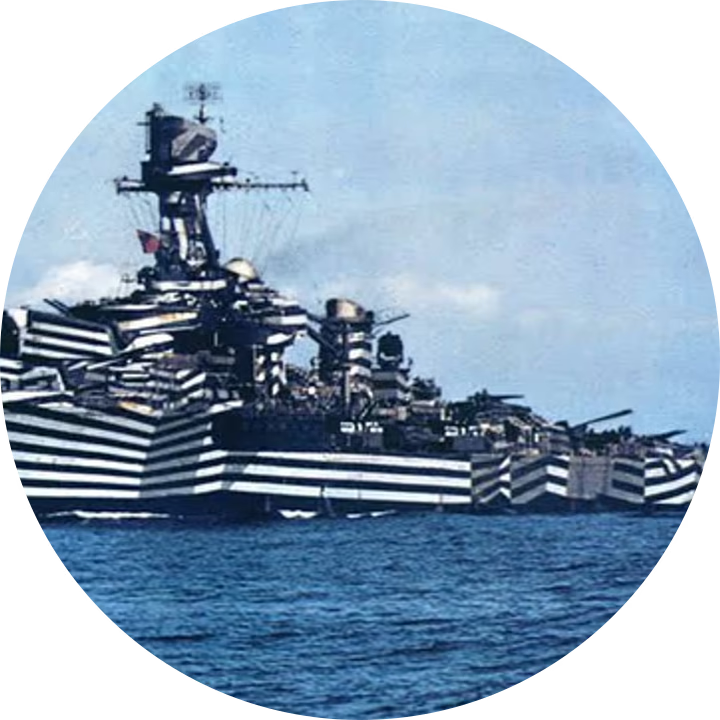
The secondary graphics come from naval dazzle camouflage, which was never meant to hide anything. Hard geometry across a hull made a gunner misjudge a ship’s heading and its range. Run over photography it does the same work, and it turns a single mark into a system.
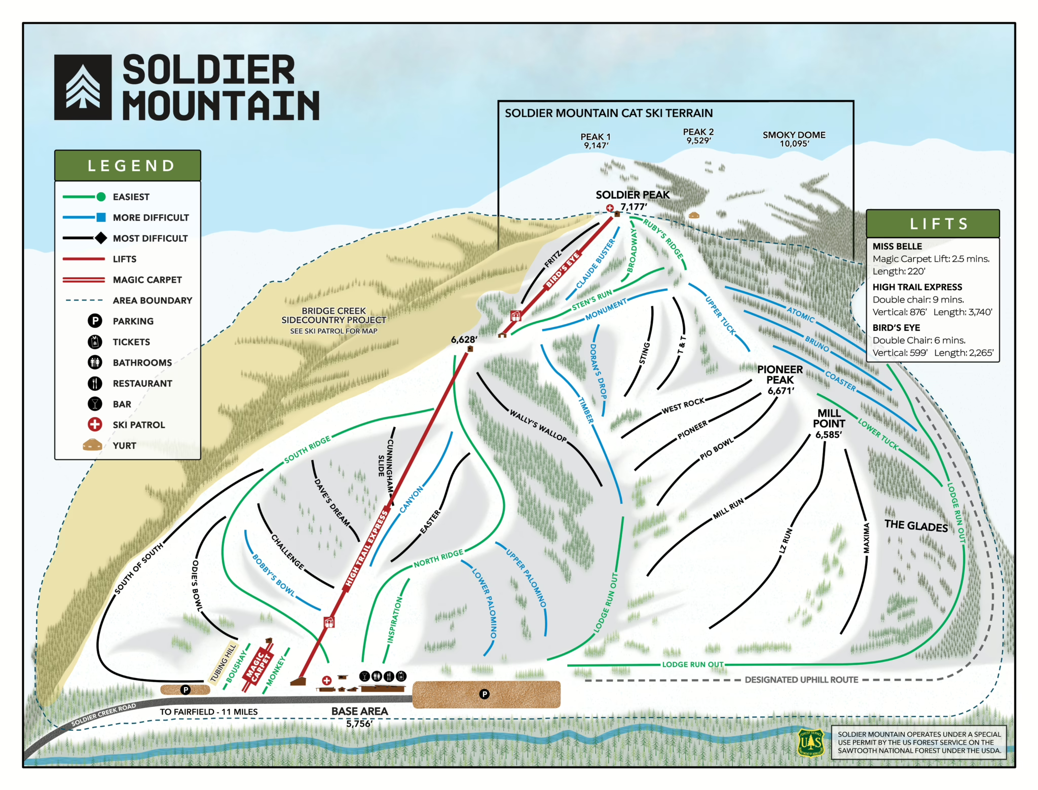
Outcome—Six seasons on
It is still what Soldier runs on, from their site to their trail map. An identity has to keep working after whoever drew it moves on. This one has.
Learnings—Key takeaways
Put it on a hat before you present it
A mark can look right in a deck and fall apart on a curved crown or across a chest. Mocking every direction up on merchandise first means the client is choosing the real thing.
Try to save the old mark first
Two of the directions carried the fox forward. Neither won, but drawing them is how you find out whether the thing you are about to throw away was worth keeping.
Next